Color and Design
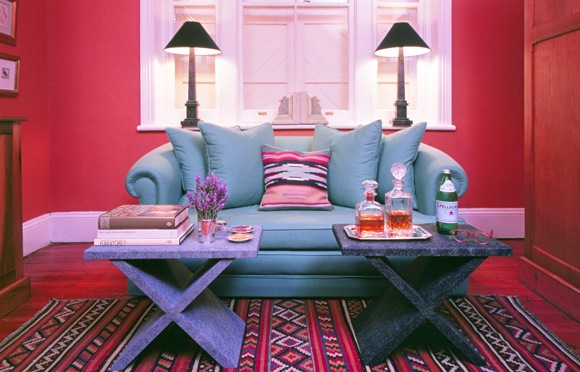
Picture by Janek Szymanowski ©
Understanding color
White light is made up of light of different colors. Anyone who has seen a rainbow has seen white light divided into its component colors, the colors of the spectrum. See the color wheel below. The red petals of a rose look red to us because they absorb all wavelengths of light except those in the red part of the spectrum; only the red wavelengths are reflected to our eyes.
The color we call black is theoretically the total absence of light. A pure black ink would be one that absorbed all light, reflecting nothing.
But to appreciate color and to make use of it, it is not necessary to understand the scientific and optical principles of light and color. One need only be aware of why colors relate to one another as they do and of how these relationships can be handled in mixing paints, in dyeing one color over another, or in planning the design. For example, of a woven fabric or a collage.
Hue, brightness, and saturation

When we talk about color, we are really speaking of three different elements that combine to produce the visual effect we perceive as colors.
The first of these elements is hue. Red is a hue, green is a hue, violet is a hue—indeed, all of the colors of the spectrum are, strictly speaking, hues, not colors. In the creation of a color, hue is just the starting point.
In addition to hue, there is the element of brightness, or value. Brightness results, for example, in darker or brighter shades of red. In a magazine illustration of an apple, the value or brightness is often controlled by printing gray dots over the red. The more gray dots crowded into the area, the darker the red of the apple will appear. In mixing paints, however, gray would not necessarily be added to the red to darken it; instead, brown or green pigments might be added.
Brightness, or value, scales are based on a progression from black to white. Black has the lowest value, 0; grays are in the middle; white is usually assigned a value of 10. If the artist is attempting to lower the intensity of a color by adding a neutral gray, he must take care that the gray is of the same brightness as the color or he will find he has also altered the value of the color, producing an effect totally different from that which he intended.
Besides hue and brightness, a color also depends on saturation (intensity) for its visual effect. Saturation, or intensity, refers to how much of the hue is present in the color. When we speak of a pale color or a strong color, we are acknowledging the effect of saturation. For instance, pink is generally a red of low saturation (although it can be of greater or lesser brightness, as previously discussed). Crimson and scarlet are reds of high saturation.
The color wheel and color chart on this page should help you understand the effects of hue, brightness, and saturation in the creation of colors.
Color harmony
For most designs you will prefer colors that work well together; in other words, colors that are harmonious in their relationships, like notes in a chord of music.
You need not rely on trial and error in choosing colors for harmony. The color wheel can be used to select harmonious hues; the color value chart will help you select hues that will also be harmonious in terms of their brightness and saturation.
There are 12 hues in the color wheel pictured on this page. The three primary hues—red, yellow, and blue—are the basis of the wheel. In addition, the wheel contains the three hues derived from the primary colors: violet (equal parts red and blue), orange (equal parts red and yellow), and green (equal parts blue and yellow). Violet, orange, and green are called secondary hues.
The remaining six hues on this wheel are called tertiary hues. They are obtained by mixing each primary color with each of the two secondary colors derived from it. A wheel with more than l2 hues can be created, of course, by continuing the recombination of primary, secondary, and tertiary hues.
Complementary hues
Several methods can be employed to identify harmonious hues on the color wheel. The simplest is to choose hues that are immediate neighbors on the wheel, such as violet, red-violet, and blue-violet. Another simple method is the selection of complementary hues or colors. Complementary hues are those that lie directly opposite one another on the color wheel.
They can be identified simply by laying a straightedge on the wheel through the center point and rotating the straightedge. Red and green are complementary, as are orange and blue. When mixed together. complementary colors will make a neutral gray. Thus, red and green will produce gray. And since green is created by mixing yellow and blue, red. when mixed with yellow and blue, will also produce gray.
More complicated methods of identifying harmonious hues on the wheel involve the rotation within the wheel of triangles and rectangles. These techniques yield harmonies called triads and tetrads; they are explained in the captions accompanying the illustrations lower down on this page. Harmony can also exist among variations of a single hue that differ in value (brightness) or in saturation (intensity).
“Contrast” is a term applied to the way in which colors alter one another when they are viewed at the same time. The strongest contrast exists between primary colors and, in brightness, between black and white. A few of the many additional ways in which colors influence one another are suggested by illustrations on these pages.
Using the color wheel
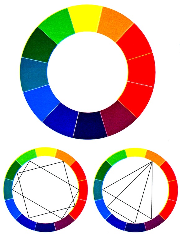
The large color wheel at top contains 12 hues obtained from the primaries (red, yellow, and blue) as described in the text on the opposite page. Color wheels with a theoretically limitless number of hues of finer and finer distinction can be created by following the procedures discussed in the text. The two small wheels at bottom illustrate the use of triangles and rectangles to identify hues that are in harmony with one another.
Triads are groups of three harmonious hues; they are identified by rotating either an equilateral or an isosceles triangle within the circle. Tetrads are groups of four harmonious hues; they can be picked out of the wheel by placing a square or a rectangle within it, as shown, then rotating the figure
How to Use Colors When Planning a Design
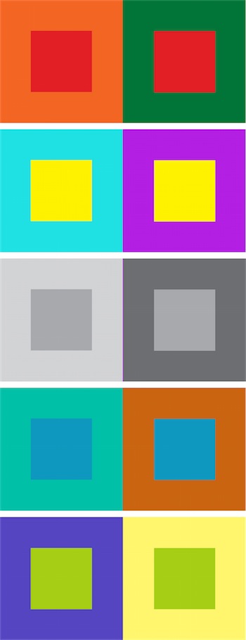
In planning a design, remember that each color is influenced by the colors next to it and by the background against which it is placed. In these examples the inner panels in each pair of rectangles are the same color, although they do not appear so because of the change in background color. You can discover many more effects by experimenting with squares of colored paper.
>>
What is the Color Wheel and How to Use It
Reference: Readers Digest Crafts & Hobbies – A Step-by-Step guide to Creative Skills.
& Wiki Commons.


10 Responses
Stencil Floors, Furniture & Fabrics - Crafting DIY
[…] Color and Design – Use The Color wheel […]
How To Do Wood Staining The Easy Way - Crafting DIY
[…] Color and Design – Use The Color wheel […]
Stained Glass Books - craftingdiy.com
[…] Color and Design – Use The Color wheel […]
Mosaics - Crafting DIY
[…] Color and Design – Use The Color wheel […]
Quilting & Patchwork - Crafting DIY
[…] Color and Design […]
Wall Stenciling - Crafting DIY
[…] Color and Design […]
Confidence With Color - craftingdiy : craftingdiy
[…] Color and Design […]
Milk84
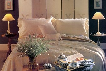
my room is a pretty basic cream color with lots of red mahogany furniture and red curtains and bed. i recently got a queen sized bed (used to have a double) and i now need a new headboard. As i am very picky, i decided to make my own. I’m just using a simple rectangle shape, but need help deciding on the color/design for the fabric. i LOVE color, especially bright colors (blue and pink are a couple of my faves) and cute floral designs. if you could possibly give links to see the fabrics, that would be great!
A couple of pics:
http://www.flickr.com/photos/49054049@N02/?saved=1
Janek
The news stands have many interior design magazines where you can get your inspiration.
mendhak
I was wanting to recognize of any advantageous websites/places to obtain curtains with colors/designs ( not plain colored )