How To Decorate With BOLD Color
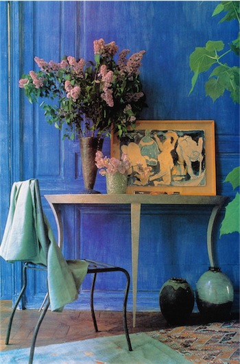
A vivid, broken paint finish like this immediately gives traditional wooden paneling quite an unconventional appearance. It also puts the modern furniture into context, with the smoky green of the console table, vase and rug and the soft mauve-lilac flowers highlighting the jewel-like brilliance of the cobalt blue walls.
Unless you are naturally daring with colors and willing to try decorating with bold color, it’s tempting to play safe by using white and pale tints as the basis of your home decorations. Such pastel and neutral shades are certainly comfortable to live with but, without some bright colors to liven them up, they can look very bland. Admittedly, stronger colors are not as simple to use. but they do create exciting schemes.
Experimenting
If you are experimenting with bold colors, you don’t have to redecorate a whole room all at once. Start by introducing strong colors gradually in new accessories. A collection of bright cushions can make a huge difference to the way a room looks without involving much upheaval or expense. Wooden furniture can be painted, lampshades altered or a bright bedspread flung over a sofa. Each minor change can be a small step towards a more colorful life.
Learn to look at color in a new way, and discover what shades please you most. Photographs in magazines are a ready source of ideas to help you to decorate with bold color, but paintings, garden borders and fabric designs, in fact any colorful arrangement you find beautiful or interesting, can provide inspiration for fresh color schemes. See our page “Color & Design”
Brilliant Backgrounds.
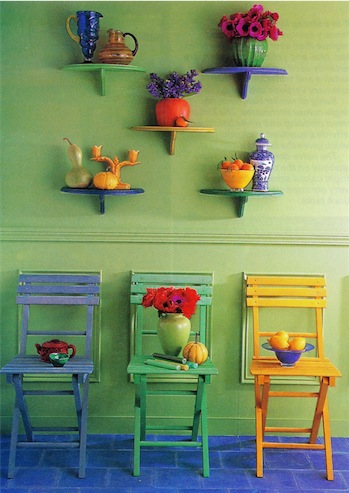
Green is often treated as an honorary neutral. Here, a bright pastel shade provides an accommodating background for furniture and ornaments in bold reds, yellows and blues, greens, purples and oranges. Among so many contrasting colors, it is the deeper shades of the orange vase, red anemones and blue jug that stand out clearly in the display.
Colored walls, floors and woodwork have a key bearing on the atmosphere and style of a room. Using a bold color as the foundation for your scheme makes a very strong design statement.
Use Instinct & Intuition
Instinct and intuition are as good a guide as any when you are choosing colors to decorate with bold color. However, you do have to think about the effect some colors can have on space and light as well. Deep colors absorb light, making a room feel cosier, especially in artificial light. Shades of red, terracotta and orange also have a warming effect, but are inclined to make a room seem smaller.
Bright pastels, like daffodil yellow, sky blue or leaf green, strike a cheerful note and really come to life in a sunny room. Cool blues and greens create an airy atmosphere and increase the feeling of spaciousness.
Take Time To Decide
>
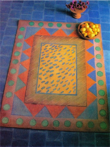
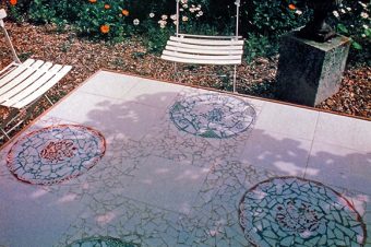
Such heavenly blue floor tiles are highly colorful in their own right, so a painted floor cloth just adds extra warmth and vibrancy. A close relationship between rug and tiles is forged by including equally strong colors in the rug design to harmonize and contrast with the blue of the tiles. The warm, earthy tone of the rug’s border is a subtle balance to the cool blue.
If you have always lived with neutral colors, a bolder alternative might take a bit of getting used to. Be prepared to live with your new color scheme for a week or two before you decide whether you like it or not.>
Reference: The Country Look—Decor & Crafts


6 Responses
Mural Art At Home - Crafting DIY
[…] art and the living use of color have been decorative features of architecture for many centuries, projecting both cultural traditions and man’s […]
PIE BOY
my roommate and i are moving to a new house soon and i am having trouble finding a color scheme for our living room. the walls are like a taupe/white. our couches are green leather couches ( a little darker than the forest green on the WiKi link below). We also have the Ikea picture below that we want to hang up and incorporate colors from, but we don’t want it to be “too” colorful. Any suggestions of accent colors to incorporate? any neutrals to incorporate? what color of end tables/coffee table/tv stand should we get? thanks!
http://en.wikipedia.org/wiki/Category:Shades_of_green
http://www.ikea.com/us/en/catalog/products/20197109/
Janek
Even though it is possible, you do not want to paint the tiles. I suggest that you get a few big canvas paintings that you like and hang those. The other idea is to get a few big blank canvasses and some acrylic paints in a few fun colors and get the kids to create their own pieces of “modern art” and hang those up.
Taylor G
We are wanting to re-decorate a school reception area. The walls are all white tile plus the floor is PCP with a wood look. How could it be decorated? What hues would go right? How can we make it to not look like a bathroom? It should be a warm, welcoming, bright environment which folks would wish To bring their kids to. There is a reception desk and an section with big throw pillows to sit on and they can read books here. Any suggestions will be appreciated.
Janek
The best is to use softer and paler colors. Pastels mix well together such as pinks and light blues. Look at the color charts here: color-design
Only Business
I like pretty and cute but I need tips about what color should I have and how to decorate and what colors to use please help!!!!!!!!!!!!!!!!!!!!!!